POLLEN
PROJECT TYPE:
WHEN:
TOOLS:
CLIENT:
prototype link ︎︎︎
WHEN:
TOOLS:
CLIENT:
prototype link ︎︎︎
UX/UI design, brand design
Spring 2022
Adobe Photoshop, Illustrator, XD; Figma
Case study project
Spring 2022
Adobe Photoshop, Illustrator, XD; Figma
Case study project
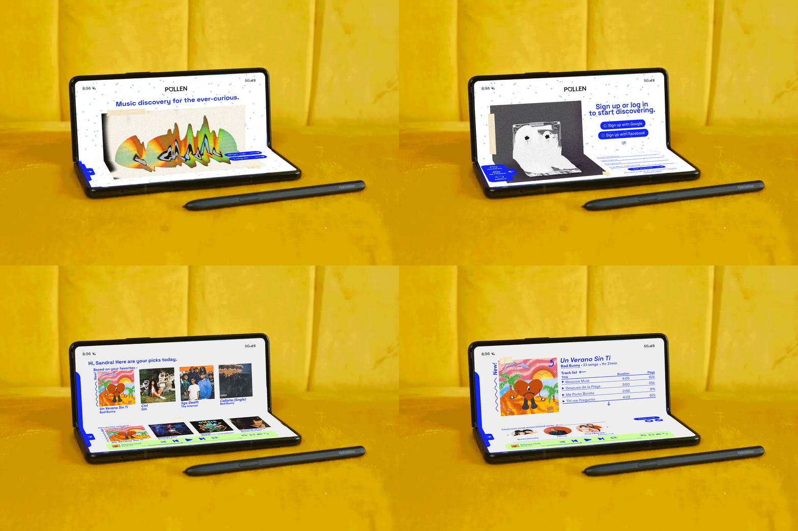
OVERVIEW -
DESIGNED FOR FOLDABLE DEVICES.
Pollen is a music discovery app for the ever-curious. Inspired by the nostalgia of music discovery through analog media (lyric sheets, artist collaborations, collectable artwork, album inserts, etc.), Pollen makes the entire musical ecosystem behind beloved albums and songs searchable.
PROBLEM STATEMENT.
The experience of music discovery that came with media like CD's, cassettes, and vinyls is disappearing. Foldable devices present an opportunity to recapture the fun of physical DIY music artifacts. No current music listening/discovery apps are integrating this nostalgic area of music, and especially not on folding screens.
WHO IS THIS FOR?
Music enthusiasts who want to keep up with new releases, discover new artists, and learn more about their favorite musicians. This product is for users that want something more engaging than a typical music listening app. They are curious about music trivia, history, and production. They have an appreciation for physical and visual music media.
WHY DESIGN A UI FOR A FOLDABLE DEVICE?
Ownership of folding devices is slowly, but steadily, growing [IDC]. Folding devices represent a unique opportunity to use multiple planes in UX/UI design. Users can interact with products in a more complex way, spatially and conceptually. This area of UX/UI design is relatively unexplored, and a music app that relies on both impactful visuals (album art) and user-driven music discovery is a great way to explore the new possibilities presented by folding devices.
RESEARCH AND ERGONOMICS -
BASIC USER TASK FLOW:
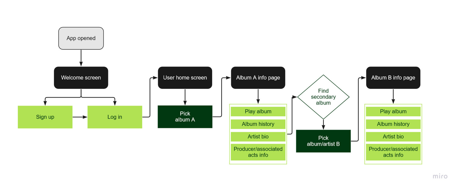
The unique ergonomics and multiple configuations of foldable devices required careful retooling of typical UX principles.
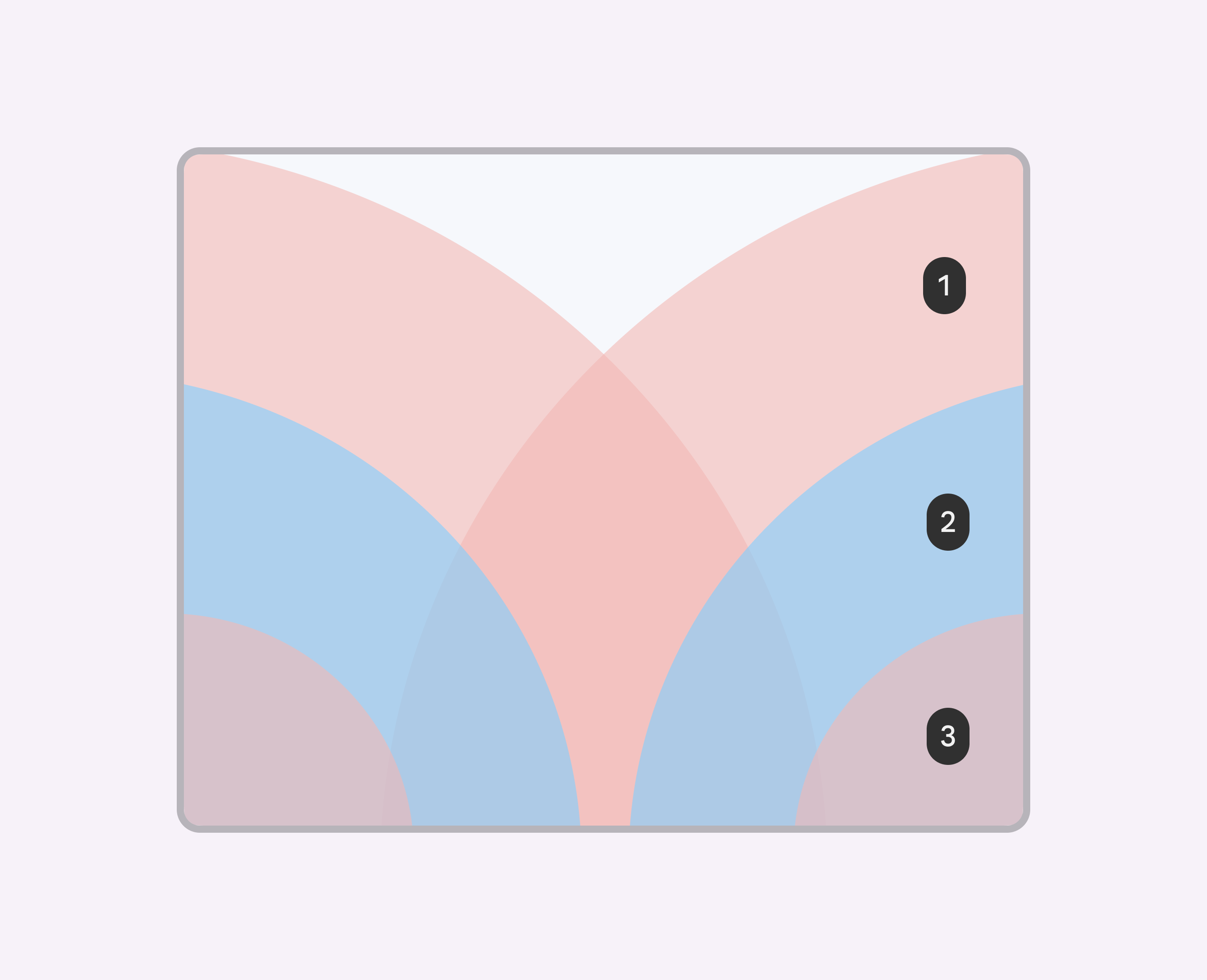
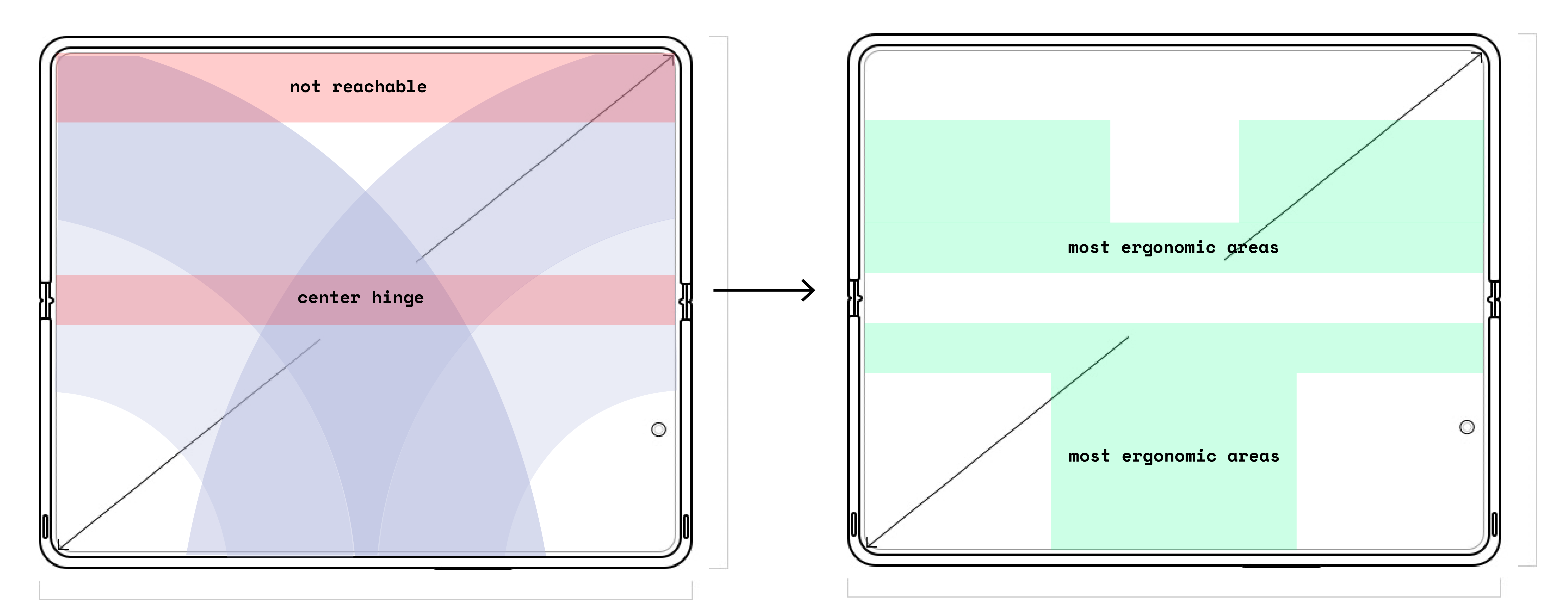
Most ergonomic reach zones are in this order: zone 2 (blue), zone 1 (pink), then zone 3 (purple). The top 25% of the screen is not comfortably reachable. The center hinge area is not always readale or usable - no interactive or informational content should land in that area.

Using these resources, I created diagrams of the ideal interactive zones and applied them to all design iterations.
VISUAL AND DESIGN SYSTEMS -
ANALOG MUSIC EXPERIENCES MADE DIGITAL.
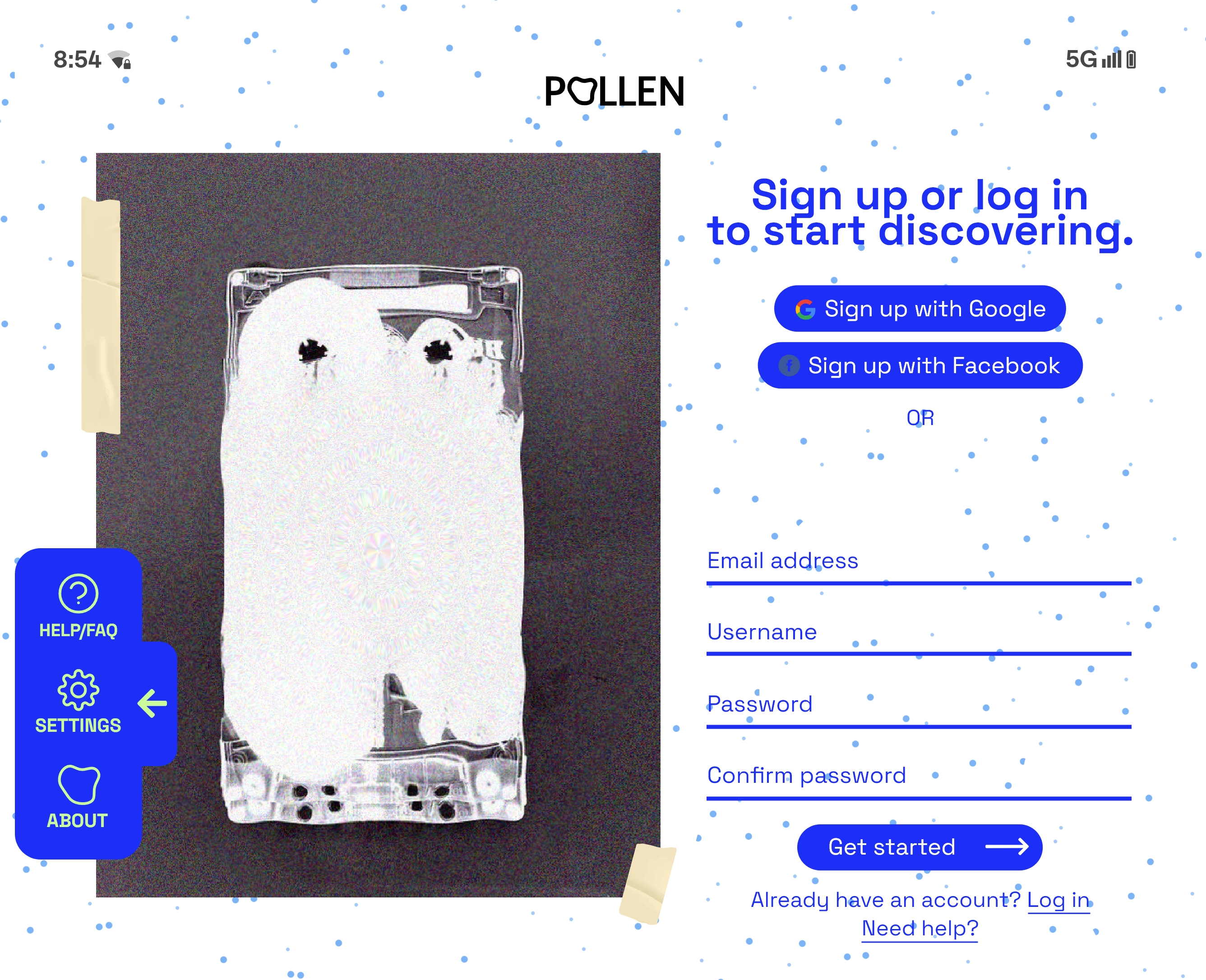
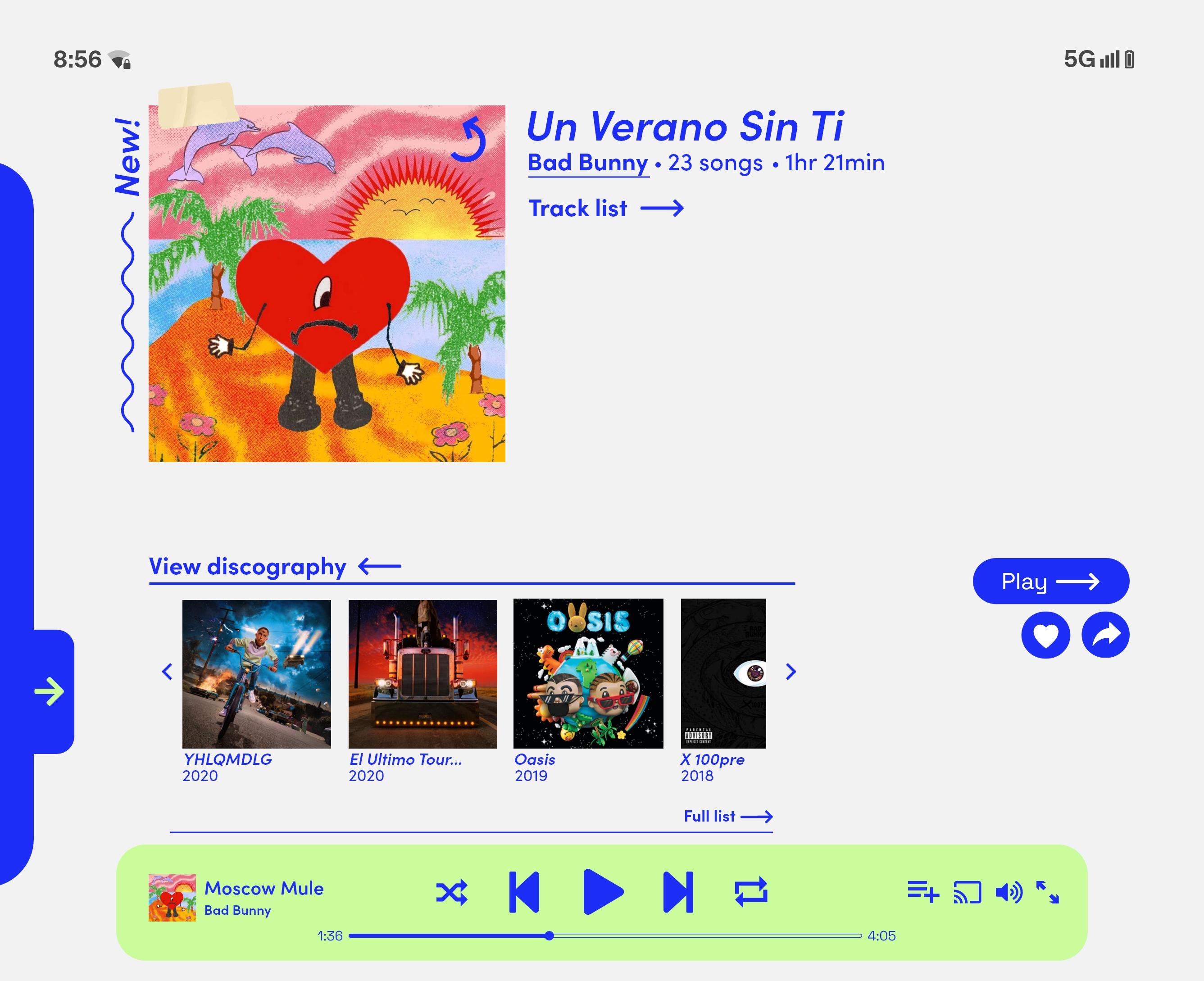
Pollen’s experience is influenced by analog music media. When handling a physical CD, vinyl, or cassette, the user typically receives print artwork, lyric sheets, posters, and other bonus materials. By using interactive album art, Pollen sustains an appreciation for how album art is crafted.Glitched scanography imagery is used throughout the app to support the concept of analog media getting transferred into a digital space.
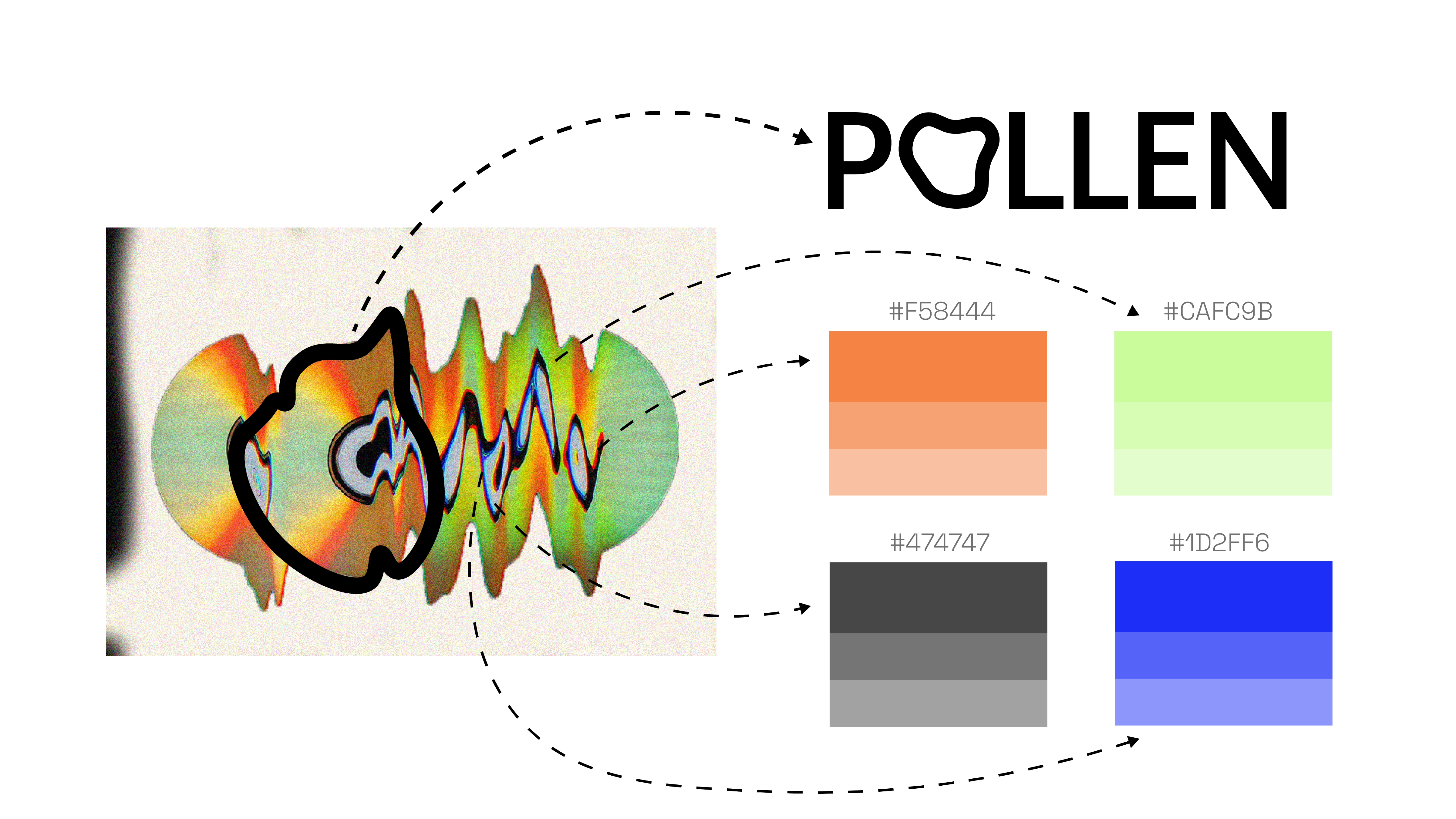
DESIGN SYSTEM.
Typefaces that were reminiscent of DIY print typefaces, but more updated and digitized, were used to complement the colors are forms drawn from scan art. Some other DIY media type elements like strips of painter’s tape are contrasted with more digital-feeling elements, like the wiggles and arrows.
WIREFRAMES AND MOCK-UPS -
LO-FI.

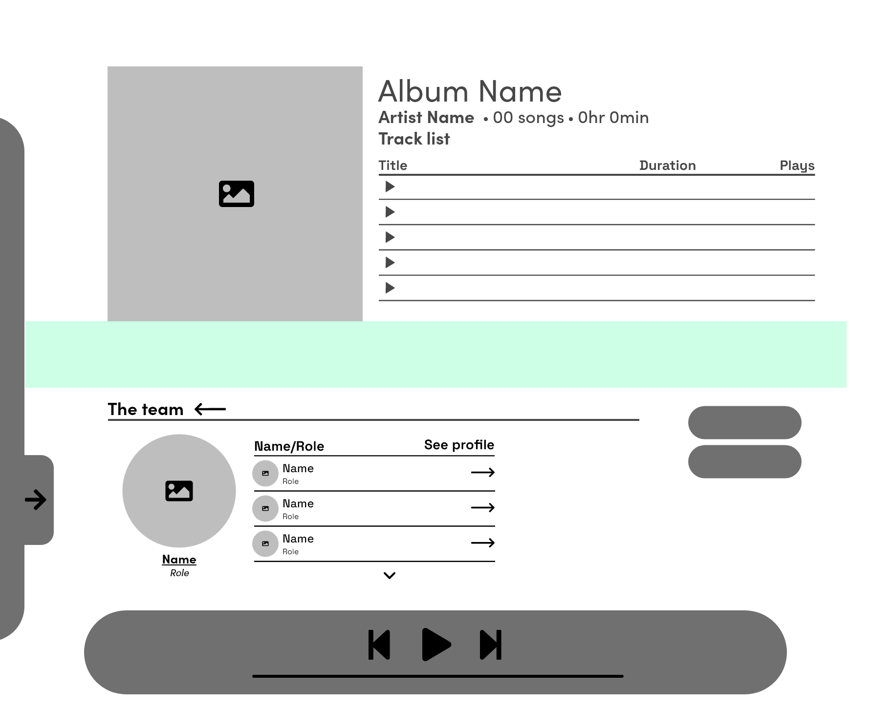
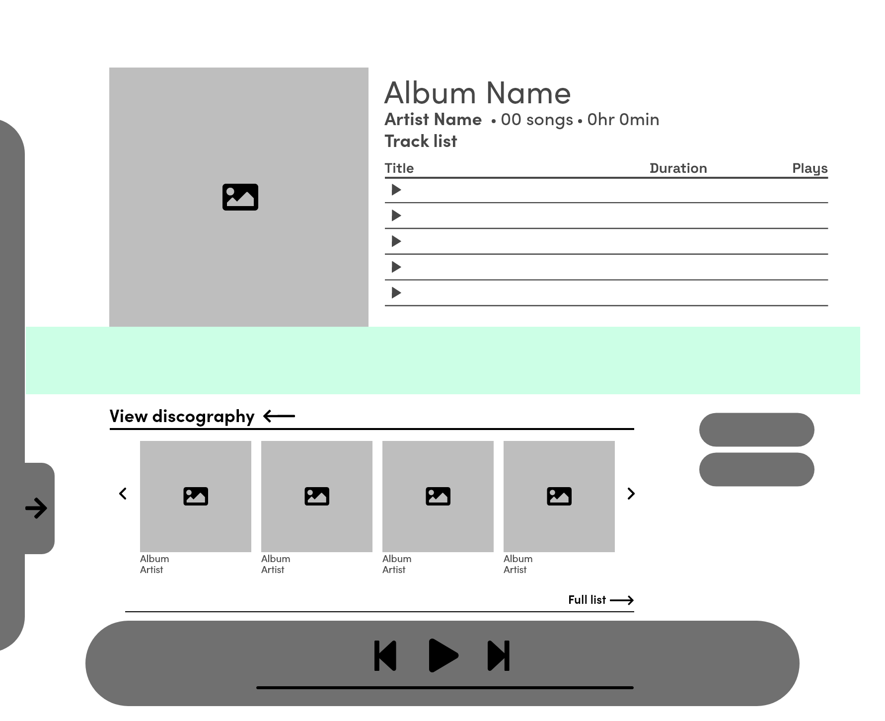
HI-FI.
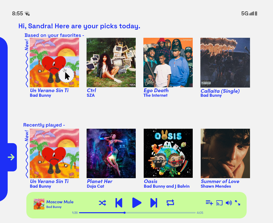
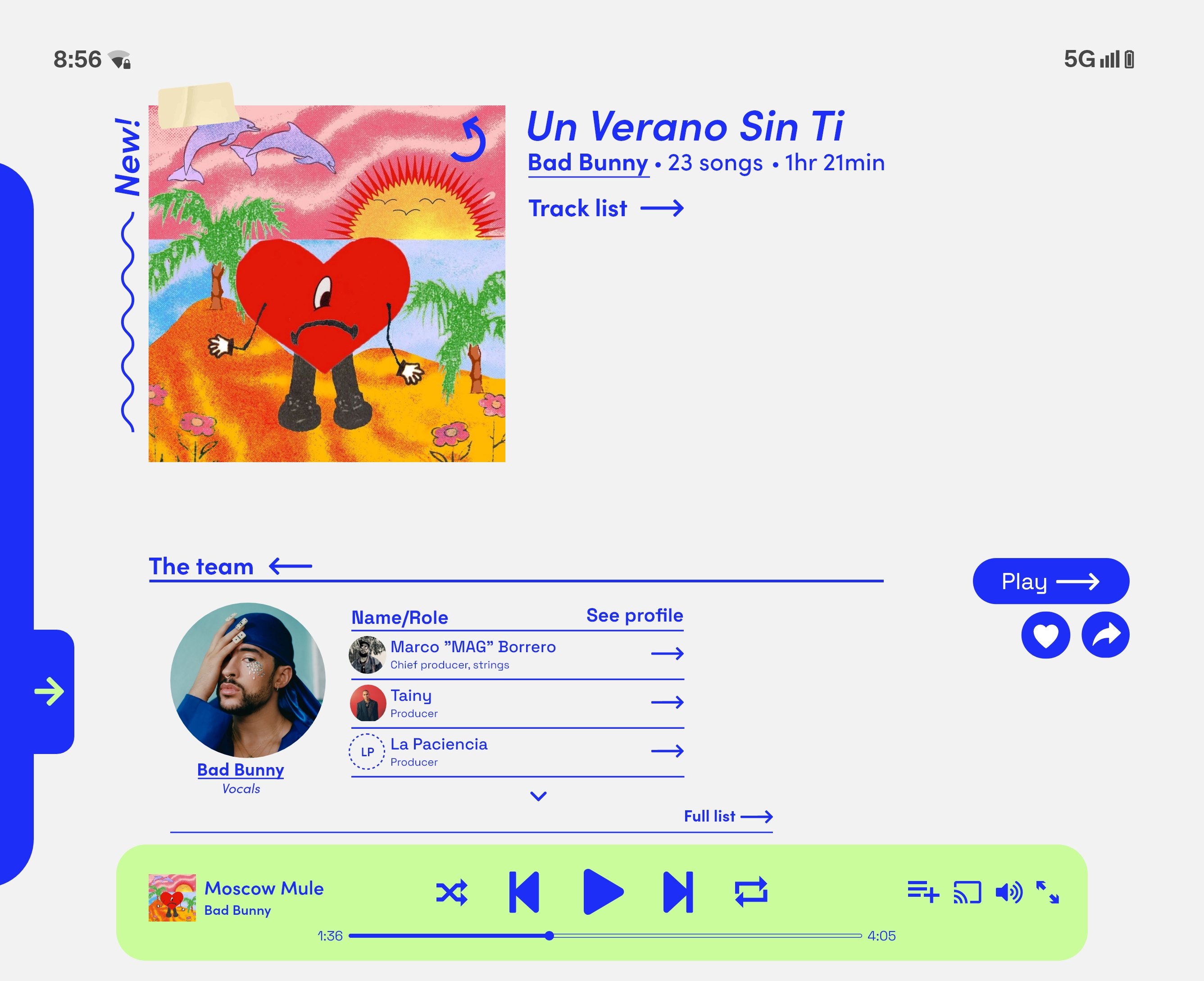

TRIGGER ALBUM ARTWORK DISPLAY
![]()
MOCK-UPS
![]()
![]()
TRIGGER ALBUM ARTWORK DISPLAY

MOCK-UPS
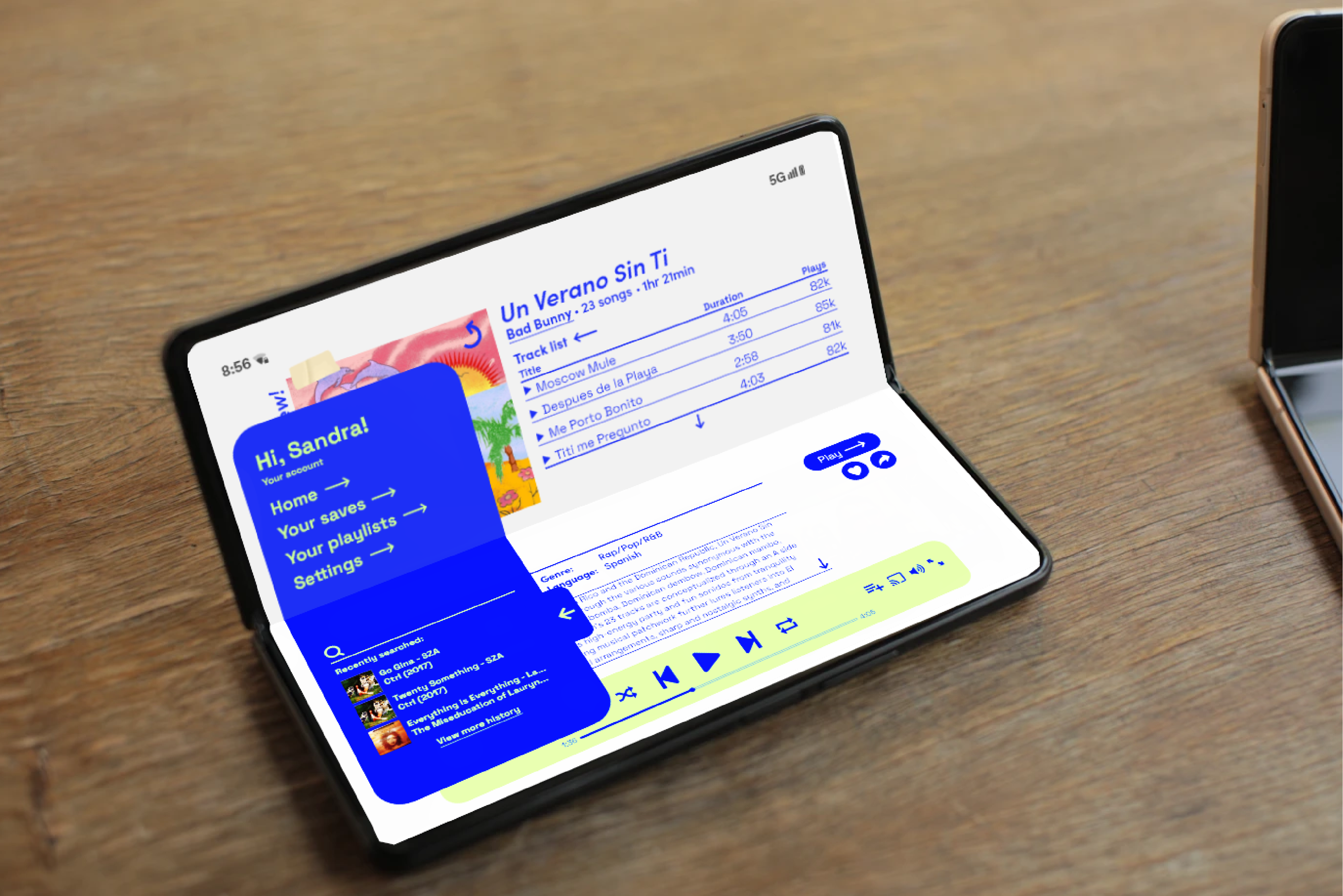
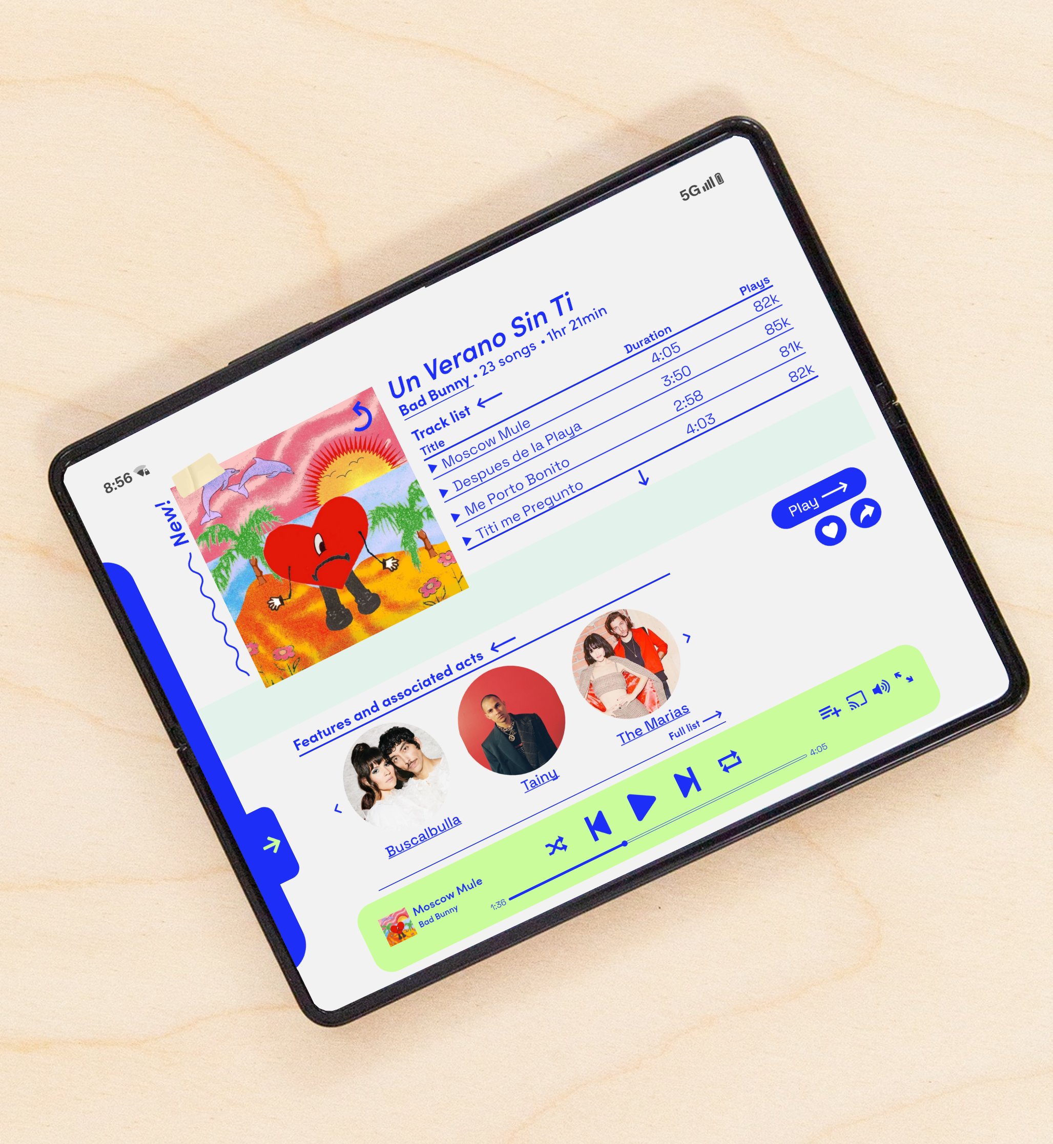
SCREENS -
![]()
![]()
![]()
![]()
![]()
![]()
![]()
![]()
![]()
![]()
SCREENS -


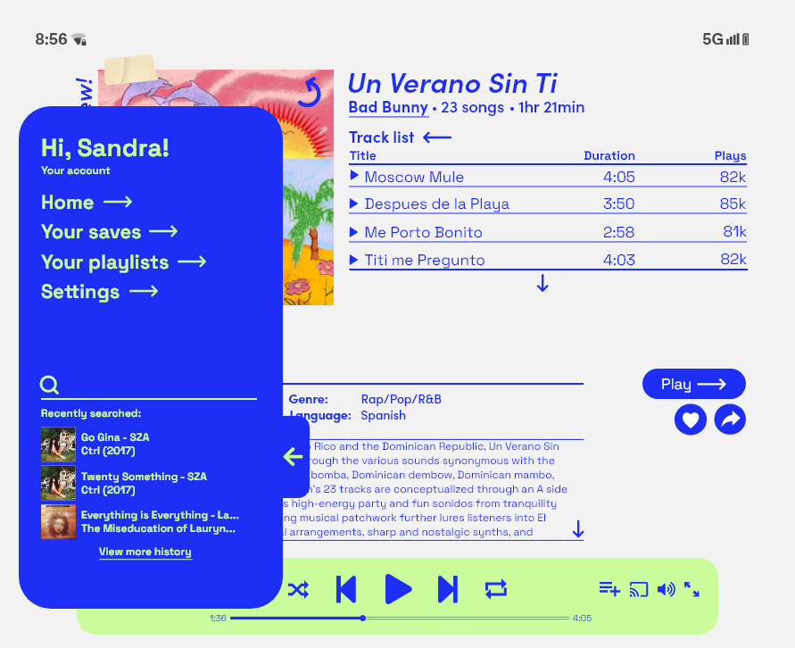
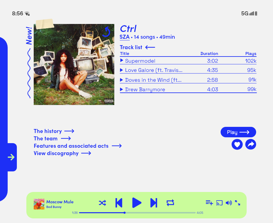
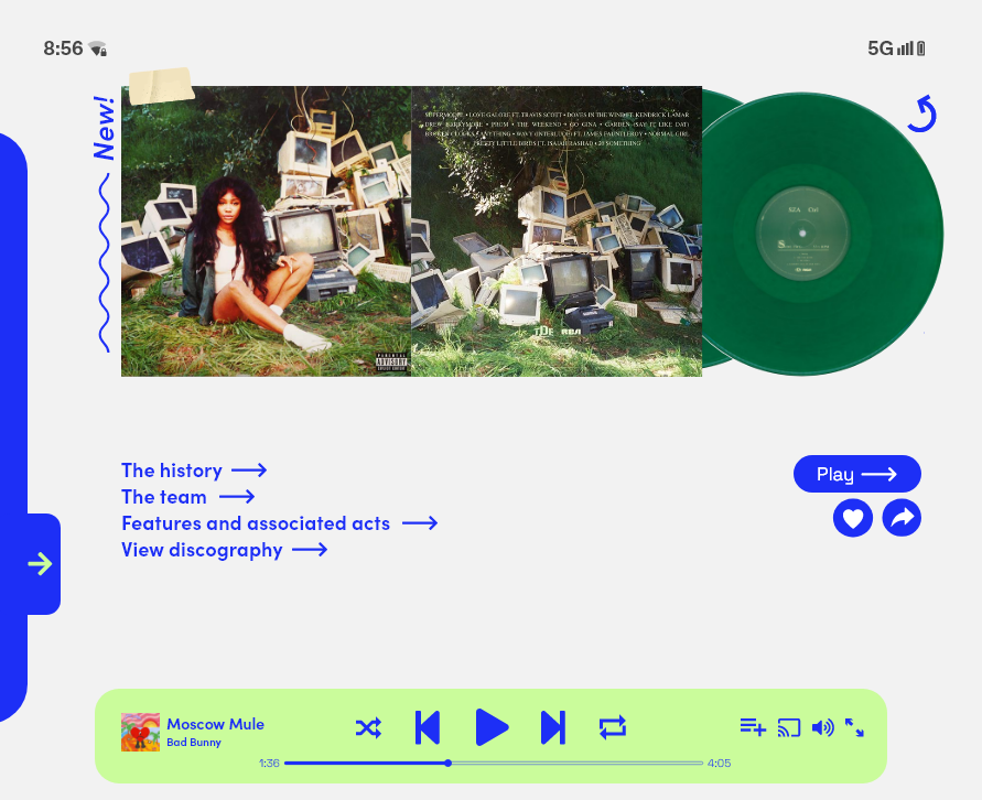
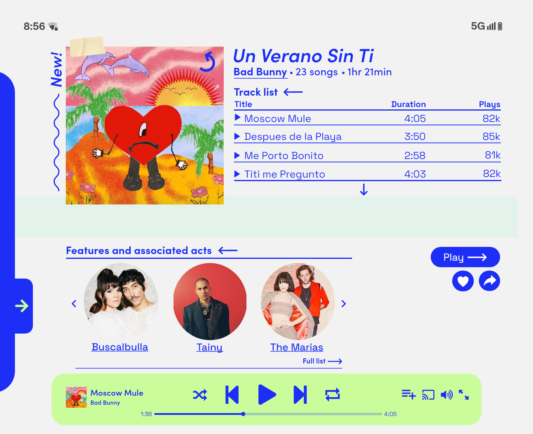


IN REVIEW -
RESULTS.
From this case study, I gained experience in taking an atypical design exercise from conception, through branding, product design, and the point of an initial launch.
I learned about working autonomously and with total ownership of a project, taking risks, and checking my own hypotheses. I increased my understanding and skills in where visual design interfaces with real world space.
WHAT WORKED WELL.
- Consistent and vibrant brand identity
- Large amounts of copy and information in a single screen
- Project met basic stated goal of taking user through music discovery from album A → album B
NEXT STEPS.
- UI design could be optimized for a wider range of devices and folding configurations (what happens when a user folds the screen in half?)
- Conceptually, more physical music media could be integrated into the experience - e.g., including a way to track physical collections like Discogs.
- Get foldable devices into users hands for real-world feedback and ergonomic testing.